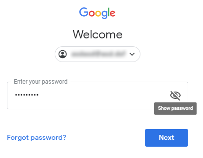
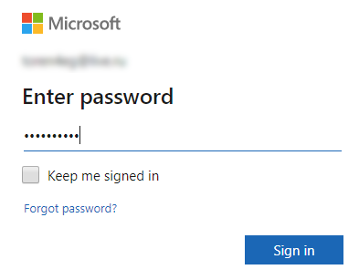
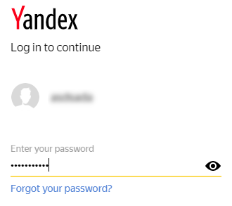
Let’s look at others experience first. How well known companies deal with it? There are couple different examples of usage this complex password input field. Google uses striked eye button with tip “show password”; Microsoft doesn’t use it at all; Yandex uses uncovered eye button.
In fact there is no consensus about eye button. Why is this so confusing to use? Cooper and Reimann explain this subject following way:
Flip-flop button controls are very efficient. They save space by controlling two mutually exclusive options with a single control. The problem with flip-flop controls is that they fail to fulfill the second duty of every control — to inform the user of their current state. If the button says ON when the state is off, it is unclear what the setting is. If it is OFF when the state is off, however, where is the ON button? Don’t use them. Not on buttons and no on menus!
About Face 2.0: The Essentials of Interaction Design 2nd Edition
by Alan Cooper, Robert Reimann
The authors point the main problem of this type of controls: unclear effect. Google in this case try to help user by showing a tip with action description. But in the other hand it just adds more confuses in my opinion.
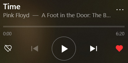
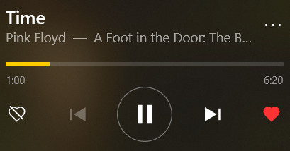
Our eye flip-flop button is represents an action: show or hide password. But users should see what state is right now to determine what happens when they click. E.g. play button (triangle) in any music app reveals when music on pause, otherwise it changes to pause button (two vertical lines) when music plays. You clearly understand the state here: just hear the music or see growing progressbar. Icon on flipflop button here represents an action, which is obvious.
Back to main topic. If we deconstruct our complex password control, we will see here state indicator — password input field itself and a control — the eye button. Move forward, we can highlight two states:
- password hidden behind asterisks (or bullet symbols), button with uncovered eye means “show password”;
- password revealed, button with striked eye means “hide password”.
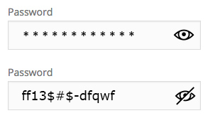
I believe this problem became a bit clear. So, if you need to implement such password input with reveal button, you would remember this article. Just use uncovered eye icon for represent reveal action.
But sometimes we feel some pressure from product owners or anything else circumstances. Whatewer, here are some examples of what can you design this password field:
or highlight button when pressed (Windows).
